The Ultimate Guide to Customizable Invitation Makers: Swap Text, Images, and Colors Like a Pro
If you have ever stared at a blank page trying to design the perfect invitation, you already know how time-consuming and frustrating the process can be. The good news is that today’s digital platforms have completely transformed how people create invitations, making it easier than ever to personalize every detail without needing a design degree. Whether you are planning a birthday party, a wedding, a baby shower, or a corporate event, the right tools can help you swap text, images, and colors in minutes. This guide walks you through the best features to look for and the top strategies for creating stunning, fully customized invitations that reflect your unique vision.
Why Customization Matters More Than You Think
A cookie-cutter invitation sends a message before a single guest even reads it. When someone receives an invitation that feels thoughtful and tailored, it sets the tone for the entire event. Personalization is not just about aesthetics; it signals to guests that you care about the details, which builds excitement and anticipation long before the event date arrives.
At the same time, the level of customization a platform offers can make or break your design experience. Some tools lock you into rigid templates where you can change only the text. Others give you full control over every visual element, from the font pairing to the background gradient to the layout of a photo collage. Understanding the difference between those two types of platforms will save you hours of frustration and help you arrive at a final design you are genuinely proud of.


The ability to swap text, images, and colors effortlessly is the gold standard in modern invitation design. It means you can start with a professional template, make it your own in a matter of clicks, and export a print-ready or shareable file without ever opening complex software. That accessibility is what makes online invitation makers so valuable for everyone from casual party planners to professional event coordinators.
What to Look for in a Customizable Invitation Platform
Before you commit to a platform, it pays to know what separates a genuinely flexible tool from one that just looks good in a screenshot. The features below are the ones that matter most when you need to move quickly and still produce polished results.
Drag-and-drop editing: The best platforms let you reposition any element on the canvas with a simple click and drag. This gives you spatial control over your layout without requiring any technical skill.
Live color editing: Look for tools that let you change colors in real time with a color picker or hex code input. The ability to match an exact brand color or wedding palette color is essential for cohesive, professional-looking designs.
Font variety and text styling: A good invitation maker offers dozens, if not hundreds, of font options and lets you adjust size, weight, spacing, and alignment independently for each text block.
Image upload and replacement: You should be able to upload your own photos, graphics, or logos and swap them into any image placeholder without the design falling apart.
Template flexibility: The best templates are starting points, not cages. Choose platforms that let you delete, duplicate, resize, or reorder any element within the template.
Download and sharing options: Make sure the platform exports in the formats you actually need, whether that is a print-quality PDF, a shareable JPEG, or a digital link you can send directly from your phone.
See also: Cleveland Business Tech Services: Local Expertise, Global Infrastructure
Top Tips for Customizing Invitations Across Platforms
1. Start With the Right Template Category
Not all templates are built for the same event type, and starting in the right category saves significant time. A wedding invitation template is structured differently than a kids’ birthday party invite, and the spacing, hierarchy, and visual weight reflect those differences. Search specifically within your event type rather than browsing general templates, and you will find designs where the layout already does most of the work for you.
When you browse within a category, look for templates that already match your desired vibe, whether that is elegant and minimal, bold and colorful, or rustic and hand-drawn. Choosing a template that is 70 to 80 percent aligned with your vision means you will spend far less time making structural changes and more time refining the personal details.
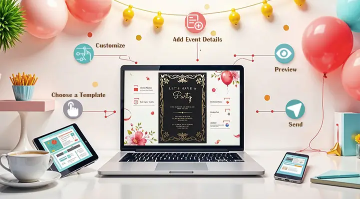
2. Use Adobe Express to Build and Personalize Invitations Online
One of the most versatile and user-friendly tools available is Adobe Express, which offers a powerful invitation maker directly in your browser. With hundreds of professionally designed templates sorted by event type, Adobe Express lets you swap out text, upload your own images, change color schemes, and adjust fonts all in one seamless workflow. The platform is designed with non-designers in mind, meaning every editing action is intuitive and visual, with no learning curve required.
What sets Adobe Express apart is the depth of customization it offers without overwhelming users. You can access Adobe’s premium font library, apply consistent color themes across your entire design, and use the background remover tool to drop in photos cleanly. Once your invitation is ready, you can download it in multiple formats, share it digitally, or send it directly to print. For anyone who wants a professional result without the complexity of traditional design software, Adobe Express is an excellent starting point.
3. Lock In Your Color Palette Before You Start
One of the most common mistakes people make when customizing invitations is changing colors piecemeal, which leads to a mismatched, chaotic final design. Instead, decide on a two-to-four color palette before you make a single edit. Use the event’s existing theme, the season, or even the venue’s decor as inspiration.
Many online invitation makers allow you to save or apply a custom color palette across your entire design at once. Take advantage of this feature whenever it is available. If the platform supports hex codes, gather those in advance so you can input exact matches rather than approximating by eye. Consistency in color is one of the fastest ways to make a DIY invitation look professionally designed.
4. Replace Placeholder Text Thoughtfully
Every template comes with placeholder text, and simply swapping in your event details without considering formatting can make a polished template look amateurish. Pay attention to font size hierarchy; the event name or host name should typically be the largest text, followed by the date and time, with supporting details in a smaller size.
Also watch for line breaks. A detail that looks clean on one line can wrap awkwardly if your event name is longer than the placeholder assumed. Adjust the font size slightly or edit the text to fit the natural rhythm of the template. Reading the invitation out loud as you edit is a surprisingly effective way to catch phrasing that does not flow well.
5. Swap Images With Context in Mind
If your invitation template includes an image placeholder, think carefully about what goes there and why. A photo of the guest of honor works beautifully for milestone birthday invitations. A venue exterior photo is ideal for weddings or galas. A fun illustrated graphic can replace a photo for kids’ parties or casual gatherings.
When uploading your own images, crop and resize them before uploading to ensure they fill the placeholder cleanly without awkward white space or stretched proportions. Most platforms have built-in cropping tools, but starting with a well-composed image will always produce a better result. Aim for a photo with good natural lighting and a simple background for the cleanest integration into your template.
6. Use White Space Intentionally
Beginners tend to fill every inch of an invitation with text and graphics, which creates visual noise. White space, meaning areas of the design left intentionally empty, is not wasted space. It is a design tool that guides the reader’s eye, creates breathing room, and makes important information stand out.
If your invitation feels cluttered after you have added all your details, start removing non-essential elements rather than shrinking the font size. A cleaner, simpler invitation almost always reads as more sophisticated than one crammed with extra graphics and decorative flourishes.
7. Match Fonts to the Event Tone
Script fonts feel romantic and elegant, making them ideal for weddings and formal dinner parties. Bold sans-serif fonts feel energetic and modern, working well for corporate events and casual celebrations. Serif fonts sit in the middle, conveying tradition and formality without feeling stiff.
A strong rule of thumb is to use no more than two fonts in a single invitation design: one display font for headings and one readable body font for details. Mixing too many typefaces creates visual confusion and makes the invitation harder to read at a glance. Many platforms automatically pair fonts that complement each other, so trust those pairings if you are unsure.
8. Preview Your Design at Scale Before Finalizing
What looks great on your laptop screen may look very different when printed at 5×7 inches or viewed on a mobile phone. Before downloading your final file, use the platform’s preview feature to simulate how the invitation will appear in its actual format. Check that all text is legible, images are sharp, and no important details are cut off near the edges.
For printed invitations specifically, make sure your design file meets the resolution requirements for high-quality printing. Most print services require at least 300 DPI. If the platform gives you an option between standard and print-quality download, always choose print quality.
9. Leverage Brand or Event Logos as Design Elements
If you are designing invitations for a company event, a fundraiser, or any occasion with an established brand, incorporate the logo early in your design process. Placing the logo in a prominent but not dominant position, such as the top center or bottom center, frames the invitation within a familiar visual identity and lends it an air of authority.
Even for personal events, a custom monogram or event-specific graphic can serve a similar purpose. Many invitation makers let you overlay transparent PNGs directly onto template backgrounds, which gives you enormous creative flexibility to blend personalized visual elements with the existing design.
10. Save and Duplicate Before Making Drastic Changes
This tip sounds simple but is frequently ignored: before you start making significant edits to a template, save a duplicate of the original or your current progress. Most cloud-based invitation platforms save your work automatically, but having a clean copy to reference or roll back to is invaluable if a round of edits does not go as planned.
Duplicating your design is also useful when you need to create a matched set of materials, such as an invitation, an RSVP card, and a save-the-date. Starting each piece from a duplicate ensures visual consistency across the suite without having to rebuild the design from scratch each time.
FAQ
What features should I look for in a free online invitation maker?
When evaluating free invitation tools, prioritize the breadth of customization over the number of templates available. A platform with fewer templates but genuine design flexibility will serve you better than one with thousands of locked-down options. Specifically, look for free access to text editing with font choices, image upload capability, and color customization without a paywall. Some platforms also offer a free tier with limited downloads, which is worth checking before you invest time designing something you cannot export. Always review the file format options before starting; a platform that exports only low-resolution files is not useful for printed invitations.
Can I use a digital invitation maker for physical printed invitations?
Absolutely, and many people do. The key is ensuring the platform you use supports high-resolution exports, typically 300 DPI or higher for print. Before you download your file, look for a “print-ready” or “high quality” export option, and choose PDF format when available, since it preserves fonts and vector elements more reliably than a JPEG or PNG at the same size. If you are sending your design to a professional print service, ask them for their specific bleed and margin requirements before you finalize your layout so there are no surprises when the physical cards arrive.
How do I make sure my invitation colors look the same on screen and in print?
Color rendering between digital screens and physical print is a well-known challenge in design, largely because screens use RGB color and print uses CMYK. The most reliable approach is to use a platform that gives you CMYK color values, or to test-print a single copy before ordering a large quantity. If your event has specific brand colors, use hex codes to set them as precisely as possible in the digital tool, and then request a physical proof from your printer to verify the output. Platforms like Adobe Express that are integrated into a broader creative ecosystem often have better color management options than standalone free tools.
What is the best way to share a digital invitation after I have designed it?
The ideal sharing method depends on your audience and the formality of the event. For casual gatherings, downloading your invitation as a JPEG or PNG and sharing it directly through messaging apps or social media is fast and effective. For more formal events, many invitation platforms generate a shareable link that recipients can open in a browser, which preserves the design more reliably across different devices. If you want to track RSVPs digitally, consider pairing your designed invitation with an RSVP management tool. Paperless Post is one example of a platform that handles both invitation distribution and response tracking in one place, and it integrates well with custom designs.
Can I customize invitation templates for events outside the United States?
Yes, virtually all major online invitation platforms are accessible globally, and the best ones support multiple languages, right-to-left text for languages like Arabic and Hebrew, and metric units for international date and time formatting. When customizing for a non-English event, pay special attention to font selection, since not all decorative fonts include full character sets for accented letters or non-Latin scripts. Testing your text in the actual font before finalizing is especially important for multilingual invitations. Some platforms also allow you to adjust paper size defaults for regions that use A4 rather than US Letter, which is important if you are printing abroad.
Conclusion
Designing a beautiful, personalized invitation no longer requires professional design skills or expensive software. Today’s online invitation makers give anyone the ability to swap text, images, and colors with ease, turning a generic template into something that feels genuinely personal and event-specific. By choosing a platform with robust customization features, following smart design principles, and investing a little time in the details, you can create invitations that impress your guests before the party even starts.
Whether you are designing a one-time celebration invitation or building a library of branded event materials, the tips and tools covered in this guide give you a strong foundation to work from. Start with the right template, lean into color consistency, and never underestimate the power of clean typography and thoughtful image choices. Your next event invitation can be just as memorable as the event itself.